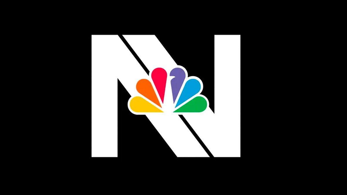
 NBC News is preparing a complete brand update for “Nightly News” as the program celebrates 75 years. Set to debut June 19, the new logo for “Nightly” is designed with a double “N” while the show’s overall palette will shift to purple and warm blues.
Maybe the network should leave well-enough alone. Remember this, from an earlier logo revamp at NBC? 


June 14, 2023 at QZVX
Martin R. Howell says:
NBC was owned at an early point by GE. The three tones heard with the peacock showing were used to identify that. The notes are G, E, and C. . .General Electric Company.
June 11, 2023 at QZVX
mavis gold says:
yes!
https://youtu.be/q1Lot-xFAwk
June 10, 2023 at QZVX
mavis gold says:
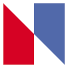
NBC updated its image in 1975 with the introduction of an abstract “N,” a bold, bright and contemporary design consisting of two trapezoids – one red and one blue
An out-of-court settlement was reached in which NBC gave Nebraska ETV over $800,000 worth of new equipment
June 10, 2023 at QZVX
Jason Remington says:
I say NBC should revive The NBC snake logo.